Barneveld
Headquarter and production
+31 342 404 840 info@iwaarden.nl
Amsterdam
Project office
+31 20 219 9108 amsterdam@iwaarden.nl
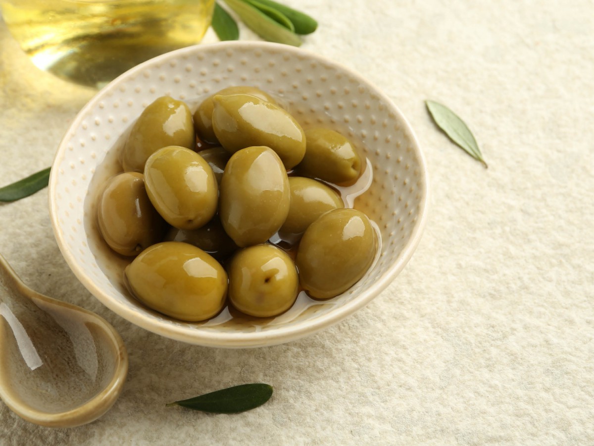
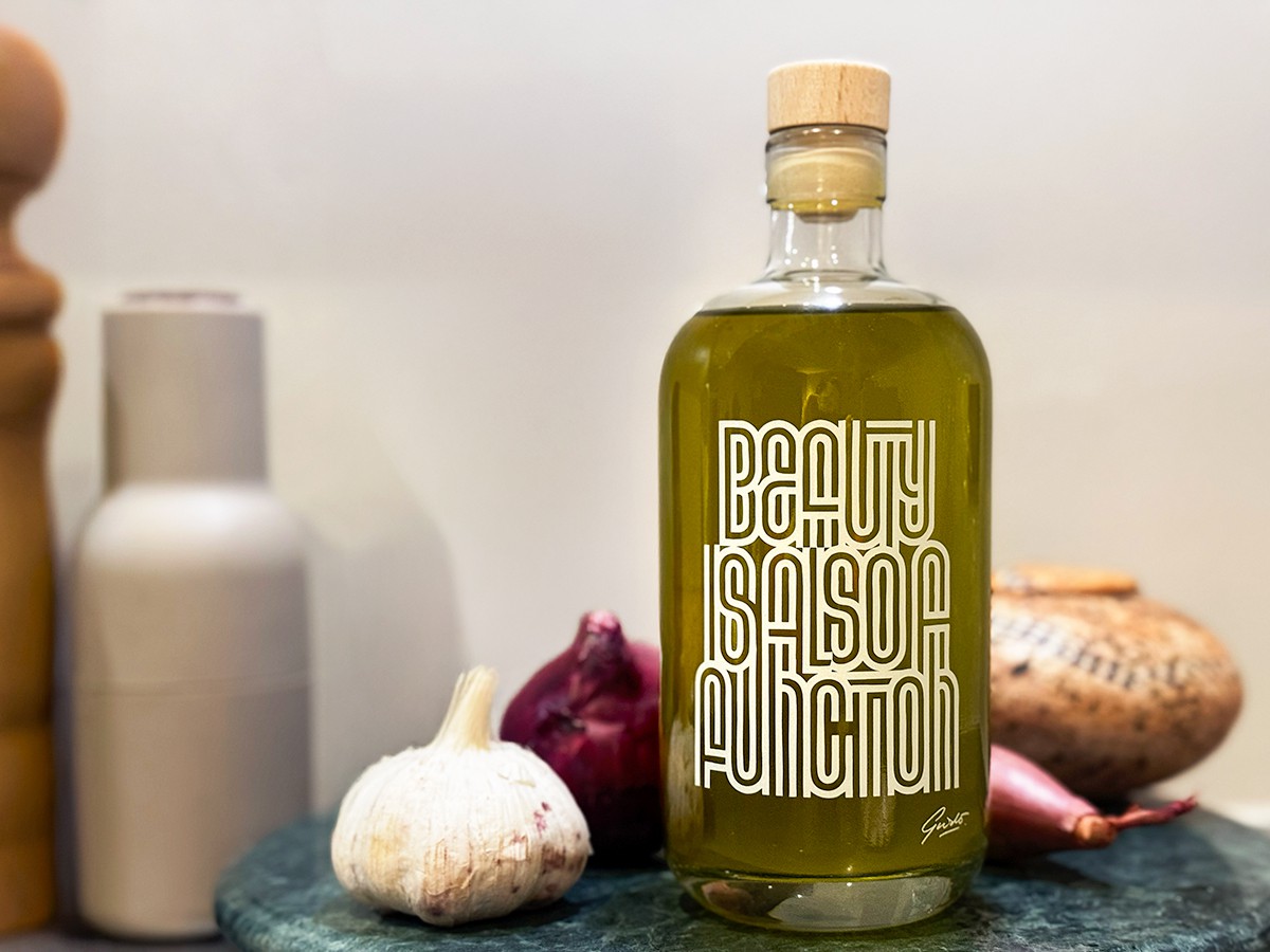
To close the year and usher in the new one, we teamed up with visual artist Guide de Boer, to create a unique bottle of olive oil. Sustainable, functional and powerfully designed. An artwork and flavour enhancer in one, ready to shine in your kitchen.
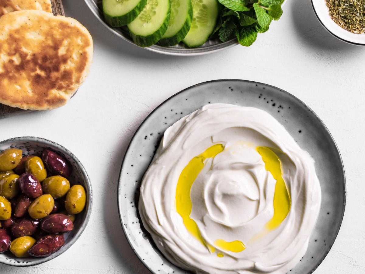
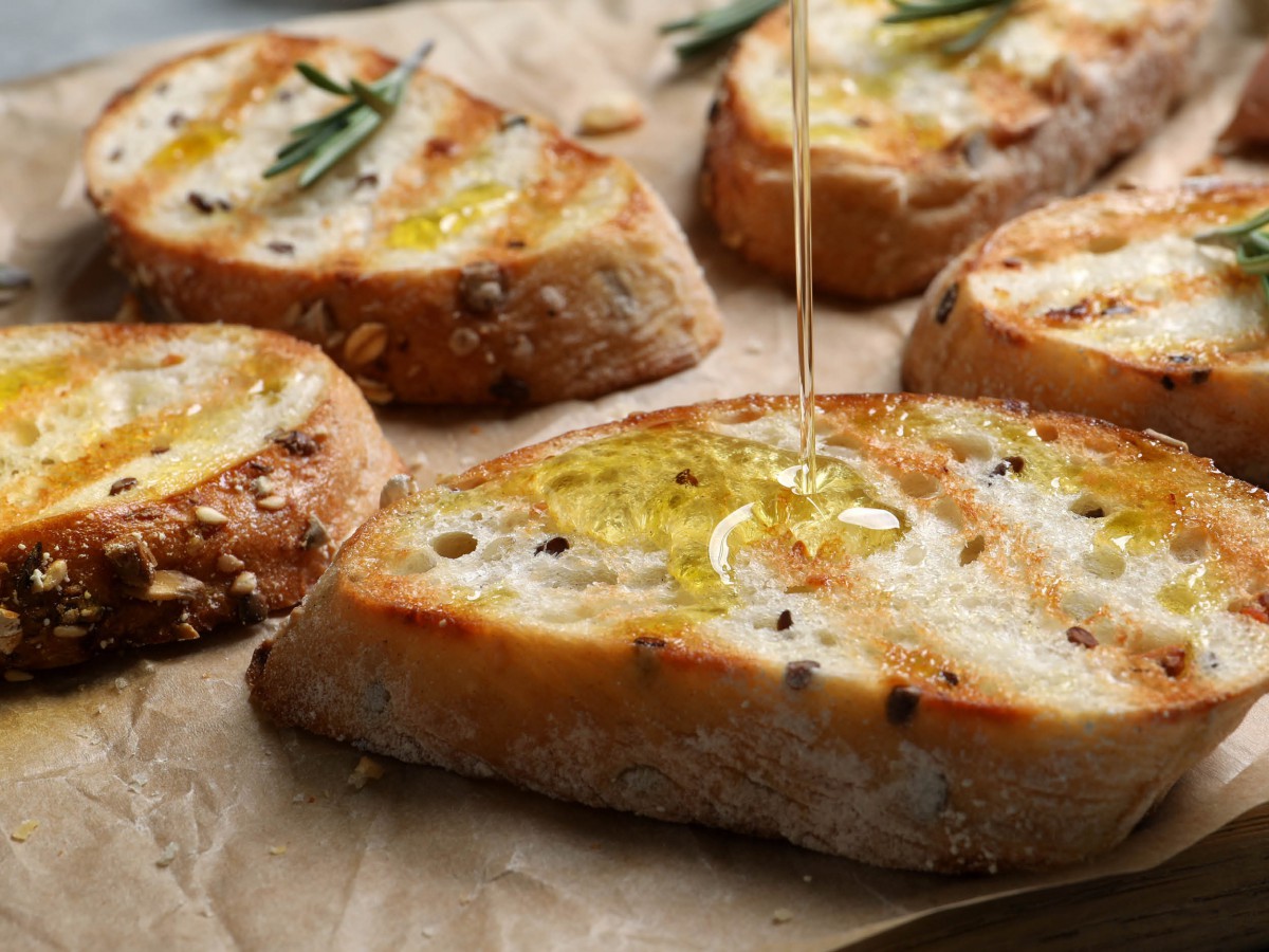
Olive oil does more for your health than a bottle of wine and let’s be honest…the bottle of wine is gone in one evening. However, the delicate flavours of this olive oil bring your dishes to a higher level, for months to come. Just as we do with your project at Iwaarden.


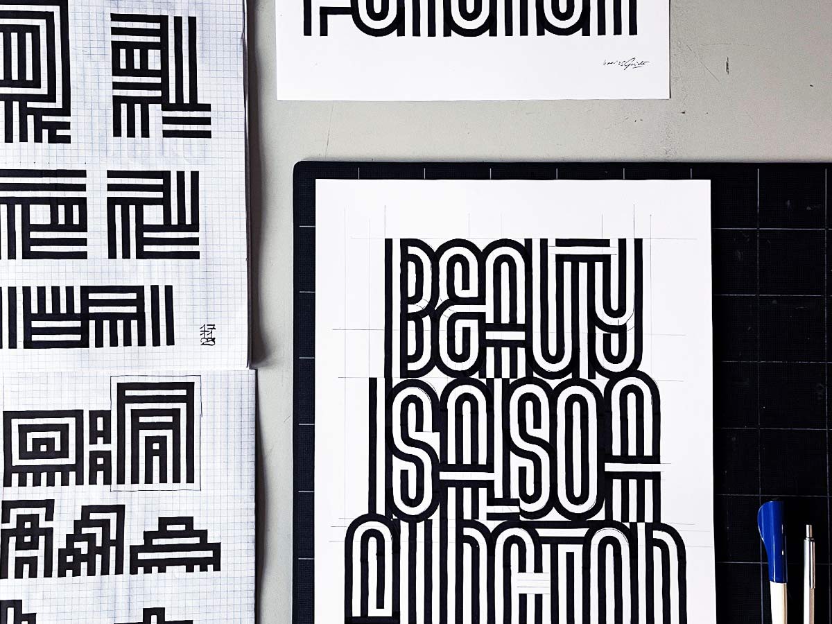
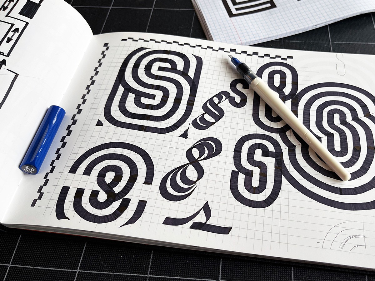
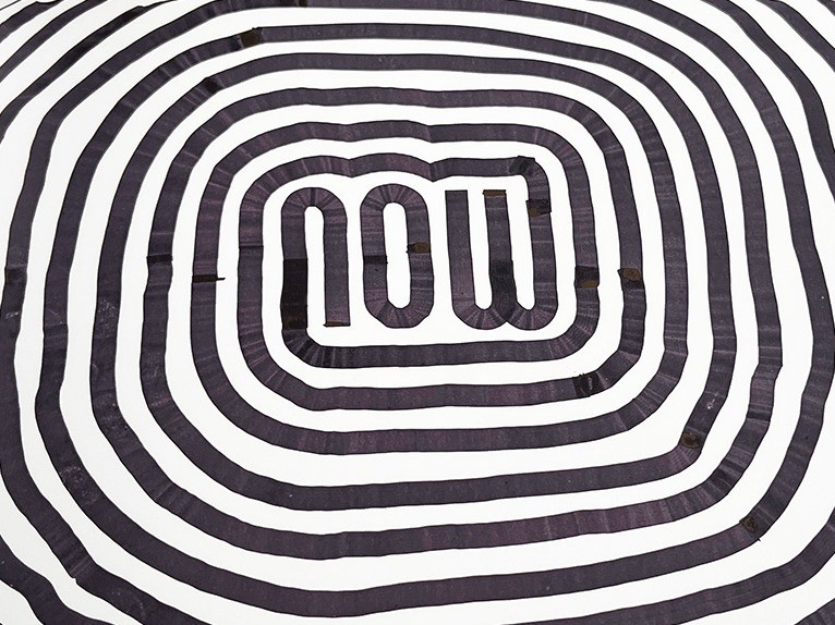
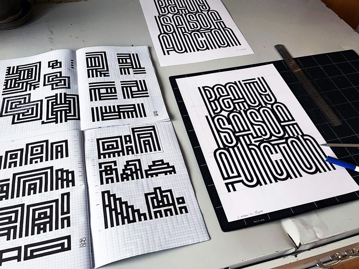
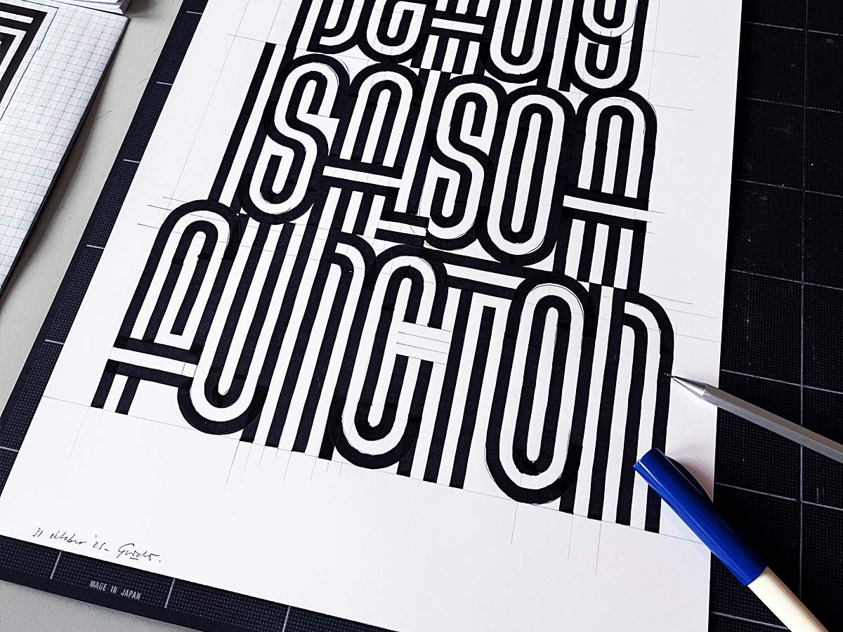
For this project, visual artist Guide de Boer created a design. His work is large, handmade and powerful. Sometimes, the impact is immediate, while other times, the strength of the image reveals itself only upon closer inspection. The rhythm of the brushstrokes, the layers and the carefully constructed simplicity all demand attention time and time again.
“As an artist, I try to convey thoughts and feelings in a visual way. As a (graphic) designer, I was focused on identifying the (communication) “problem” and how to create a suitable solution within that context. Now, I often find myself working at the intersection of those two roles.”
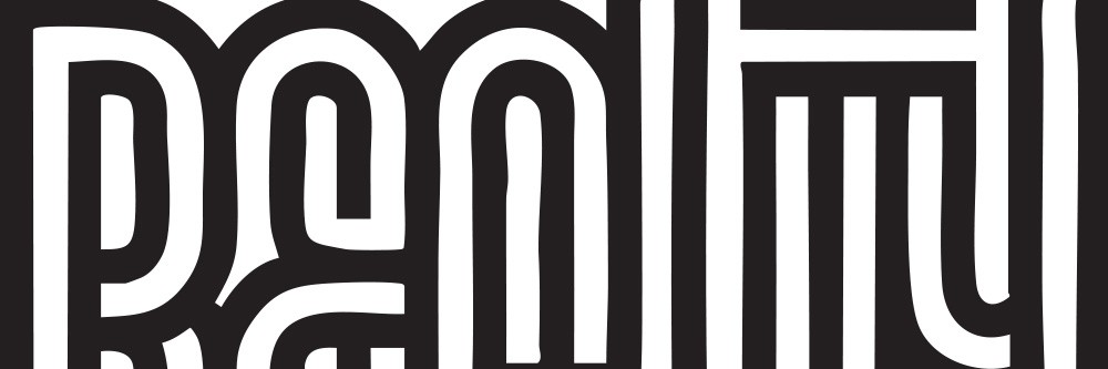
Guido is known for his contrasting black-and-white typography. He deliberately uses both positive and negative space, bringing opposites together in one powerful image. This interplay of contrasts aligns seamlessly with what we do at Iwaarden: combining craftsmanship with modern printing techniques, functionality with aesthetics and simplicity with layered meaning. What may appear simple at first glance, is created with care, craftsmanship and intention.
“As Lawrence Weiner (one of my favourite contemporary artists) once said: “an artwork is simply a utilitarian object”. I find that a very striking statement. After all, art is certainly a tool you can use to spark wonder, sharpen your thoughts or even change them. In that sense, it is indeed a utilitarian object. I find the active connotation very beautiful: get started with it.”

“For the design of this artwork, I want to play with the meaning and the sense of wonder. Nowadays, we are so used to things coming at us in easily digestible chunks. I believe that we need to be challenged in order to evoke a certain sense of wonder.”
Curious about Guido’s work? There is a good chance you’ll be just as excited as we are! Check it out here.
At Iwaarden, we believe that something should add value. Not just for the moment, but for the long term. That’s why we chose a timeless, refillable bottle of olive oil: sustainable, functional and always within view. Just a little different. Not flashy, but certainly present.
This artwork reflects our i-values: inspiring, impact and integrity. It is not just about the product itself, but mainly about craftsmanship, the process and the meaning behind it. What we create is always more than just something functional. Because beauty is also a function. That’s exactly what we make visible with this wonderful piece of art.

Guido de Boer
Beeldend kunstenaar

“When creating my work, including text, I like to play with people's expectations. Just like this bottle: you think the text is going to tell you something important, but that's not always the case. My work is about discovering, experiencing and seeing what you didn't see before.”
Headquarter and production
+31 342 404 840 info@iwaarden.nl
Project office
+31 20 219 9108 amsterdam@iwaarden.nl